Web Redesign: From Confusion to Clarity that Converts
Product Designer & Copywriter

Fall 2024 - Spring 2025
Just skimming? Here's the 1-min recap
The Why, What, and Wow
The Why
As new features launched, our old site fell out of sync—making it harder for clients to understand our value and leading to missed business opportunities.
The What
I led the full redesign—restructuring pages, rewriting key copy, refining visual style, and adding transitions—all aligned with our evolving product and strategic direction.
The Wow
Global names like Lancôme, Levi’s, and Under Armour reached out. We also started getting new leads from Hong Kong.
See the story beneath the surface ↓
Background
Our Vision Evolved—But the Design Stayed Behind
We had new services. New value. But a site still stuck in 2020.
Originally built for a single product, the site no longer reflected who we were—or what we offered.
As the sole designer, I led the full redesign—from structure and layout to copy and visual direction. Working closely with PMs and developers, I turned a scattered site into a clear story that sells.
Problem
When Everything Speaks, Nothing Stands Out
Our homepage had turned into a catch-all maze—too many messages, too little clarity. Here's what held it back:
1. Messaging felt inconsistent and hard to follow
2. Flat layout made every section compete for attention
3. No clear path leading users to the actual product
4. Visuals lacked purpose and failed to support the message
Approach
01 Copywriting that Paints a Vivid Picture
Our services are built for businesses—but success depends on the end customer’s experience.
I rewrote the copy to reflect that: friendly, confident, and focused on value and outcome.
These lines don’t just inform. They help people visualize what better really looks like.
Note: The final live version may differ from my design, as changes were made after my departure from the company.
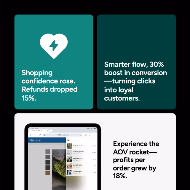
02 Visuals that Do the Talking
Take our AI Size suggestion service, for instance. We had strong tech—but weak presentation. The message wasn’t landing, and the visuals didn’t help.
I redesigned the section to emphasize benefits over buzzwords, using sharper visuals and clearer flow to create a story that actually sticks.
Note: The final live version may differ from my design, as changes were made after my departure from the company.
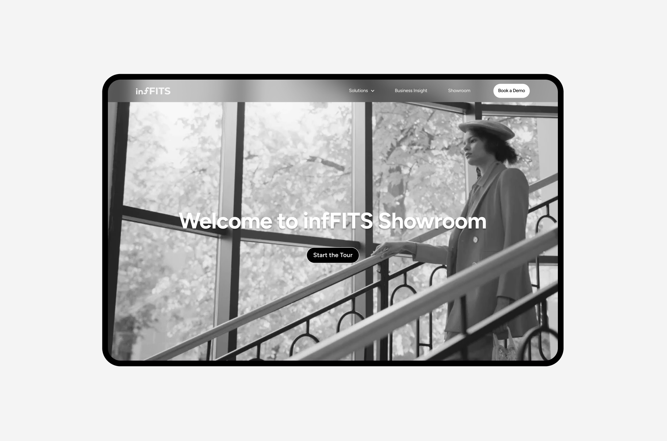
03 Motion as a Guided Experience
What’s the best way to explain a product? Let users experience it.
I proposed a new showroom page—an interactive journey that lets potential partners see the flow from a customer’s point of view. From discovery to decision, the motion-led design creates curiosity—and drives real engagement.
Note: The final live version may differ from my design, as changes were made after my departure from the company.
Result
Getting Attention form Big Names!
Post-launch, we started getting attention from big names like: Under Armour, Lancôme, and Paula's Choice.
The new site didn’t just look better. It made people care—and that made them click.
Reflection
Learnings
01 Copy that converts
This was my first time writing for a full B2B site—and I quickly realized that good copy isn’t just clear, it’s persuasive. I studied how other tech companies speak to pain points and back up their value with impact data. That combination builds trust and drives action—and I brought that same thinking into every headline, metric, and message.
02 Building a Site from the Ground Up
Going from zero to launch taught me how many details shape a high-performing website. It’s not just layout and visuals—it’s SEO, load time, file size, animation, messaging, and flow. If I did it again, I’d think even more about when users are most likely to convert—and how to design for those moments.
03 Letting Visuals Do the Talking
Not everyone reads—so visuals need to speak clearly. I focused on making illustrations and layouts that convey value instantly, even without reading the copy. Clear structure, simple motion, and before-after storytelling became key to making the message stick.