From Chaos to Clarity: A Ground-Up Admin Redesign
Product + UX Designer

Fall 2024 - Spring 2025
Just skimming? Here's the 1-min recap
The Why, What, and Wow
The Why
The original system was functional—but fragmented. Key tasks were buried under layers of clicks, and clients heavily relied on sales reps just to get started.
The What
Redesigned the admin from the ground up: built a new information architecture, shipped 9 new feature designs, delivered 7 UX improvements, created 24 prototypes, and flagged 6 QA issues. The new design is a clearer, faster setup experience—for both clients and internal teams.
The Wow
Users could now preview and manage everything with fewer clicks—no walkthrough needed. One client even said the experience felt more intuitive than some major Taiwanese platforms.
See the story beneath the surface ↓
[ A very open-ended start ]
Hey Lia, we're about to build this admin panel system for setting up AI selection. And this is what our admin currently looks like and functions.
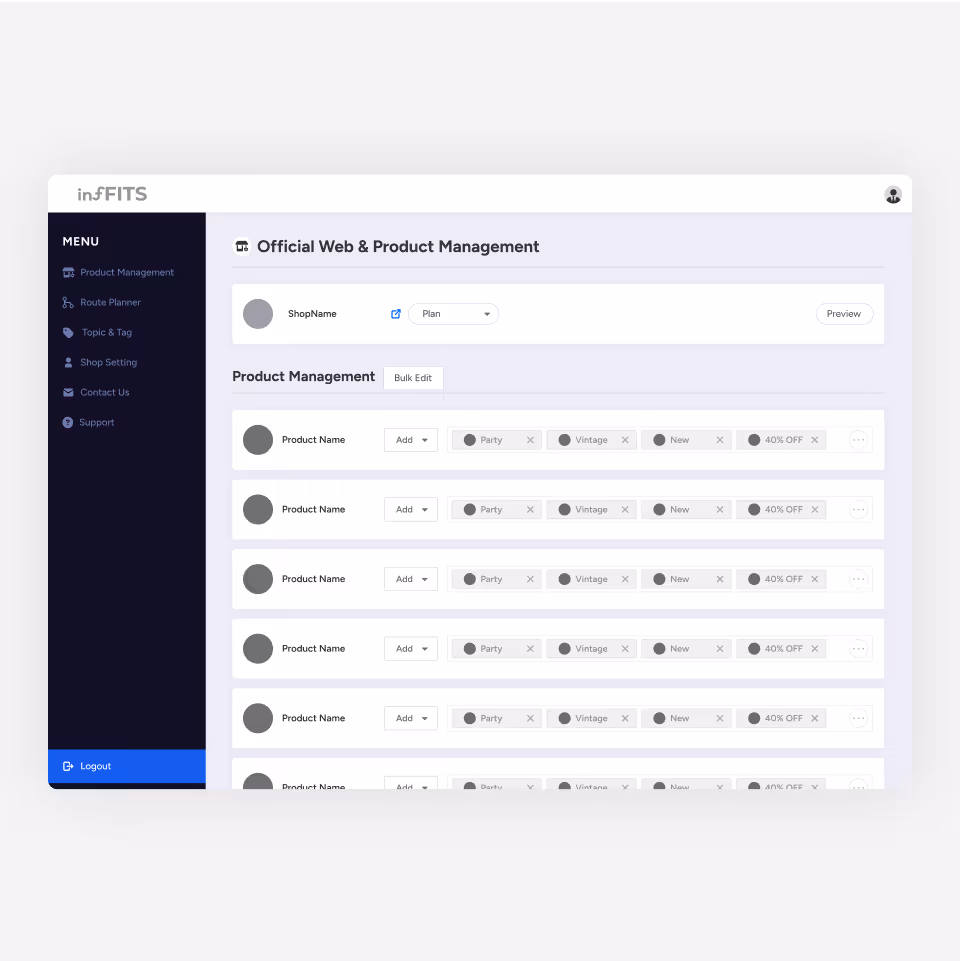
Example Feature: Old Product Management
Current state of our legacy system
Functional, but Far from User-centered
The original admin had basic functionality—but no user-centered thinking. As features expanded, the system couldn’t scale, causing friction for clients and overwhelming the sales team with repeated onboarding requests.
What role does it play?
The Foundation for Personalized Shopping
Before customers can enjoy tailored recommendations, businesses need to do the behind-the-scenes work—tagging products, setting up topics, and building plans. This admin panel powers all of that. But the original setup made the process harder than it should’ve been.
[ However, the challenge was that ]
We were building the full experience without real users and research to guide us.
Here’s how I tackled it early on, despite the constraints.
Example Feature: Plan Builder (Old: Route Planner)
Features Research & Analysis
Fragmented Views, Costly Memory
Navigating details under main tasks—topics, tags, and plans—required multiple clicks, making it hard to stay oriented or grasp the full picture.
Steep Learning Curve
Through discussions with PMs and internal teams, I learned that most clients relied heavily on our sales team for walkthroughs. While manageable early on, this model didn’t scale. The system’s built-in guidance was limited to static text—slowing down learning and adoption.
Interface Studies – How are admin panels typically structured?
Designing with Clarity and Context in Mind
To create an interface that’s both intuitive and scalable, I studied how other admin panels and dashboard tools are structured.
Common patterns I observed:
• Grid-based (Bento-style) layouts
• Top navigation for global sections
• Left-side menus for navigation or advanced settings (some fixed, some collapsible)
These insights helped shape the foundation of my redesign—ensuring users could explore confidently without feeling overwhelmed.
Define & Goals
Clarity + Guidance for a Complex Setup
The redesign had to simplify a multi-step process that involved tagging products, organizing topics, and building plans. That meant two things:
• Offer a clear overview for each core task
• Provide step-by-step guidance within each page
By making the system more self-explanatory, we aimed to support scalability and empower clients of all experience levels.
Design
01 One Click, Quicker Clarity
To reduce friction, I replaced the original editing pop-up with a drop-down block. This gave users a quicker, less disruptive way to manage content—minimizing clicks while keeping context clear.
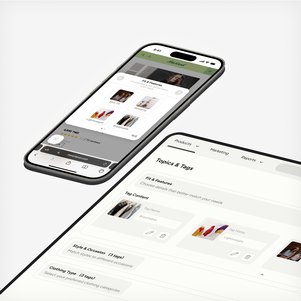
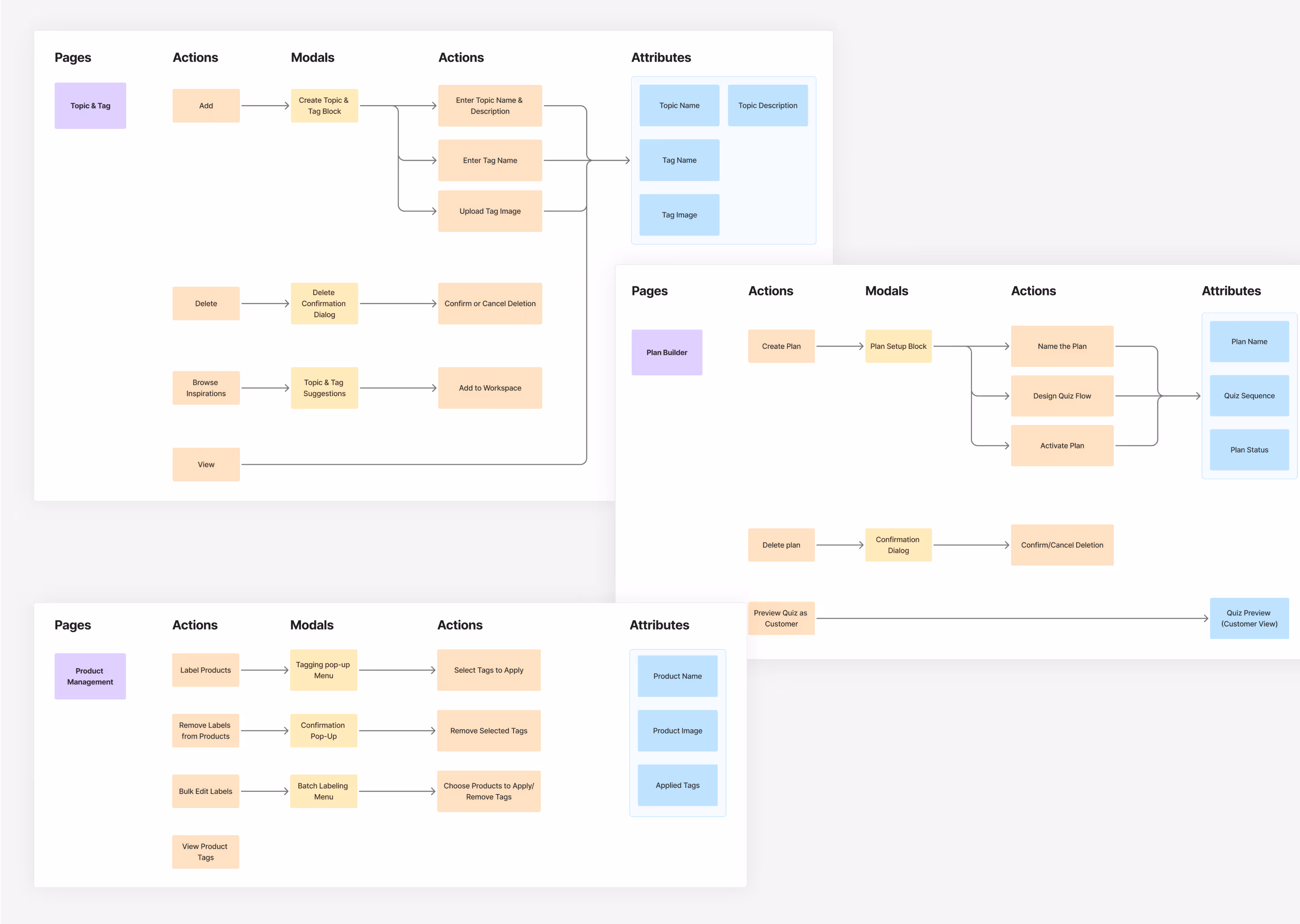
[01] Topic & Tag
Users now get an instant overview of existing topics and tags—making it easier to spot gaps and decide what to build next.
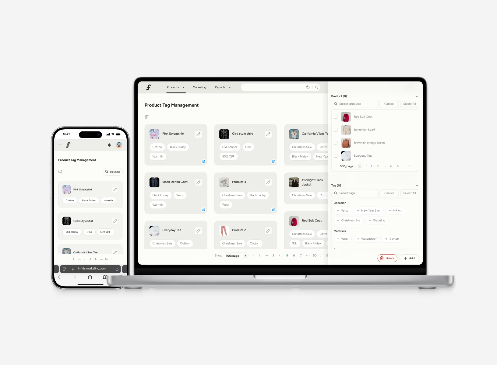
[02] Product Tag Management
Each product’s tags are clearly displayed without extra clicks or scrolling—speeding up both individual and bulk edits.
[03] Plan Builder
Users can view each plan’s details at a glance and jump into edits with just one click—bringing more control and confidence to the setup flow.
02 A Round-the-Clock Assistant Along the Journey
To reduce reliance on sales reps, I designed an onboarding flow that walks users through setup step by step. It’s structured to complete 80% of the process independently, with the final 20% left for brand-specific customizations.
This onboarding flow walks users through the entire setup—from picking or creating topics, taggingThis onboarding flow guides users through the entire setup—from selecting or creating topics, tagging products, to building a plan—making the end-to-end journey feel smooth and approachable.
How the post-launch went?
Scalable, but Nearing the Edge
The launch delivered a streamlined system that met client needs. But as new requests emerged—especially in the plan builder—some cracks started to show. It revealed the need for future-proofing if the product continued to grow.
A Proposal for What’s Next
After launch, I proposed a second iteration to improve long-term scalability and adaptability.
While it wasn’t implemented due to resource constraints, the foundation is in place—ready to grow when the team is.
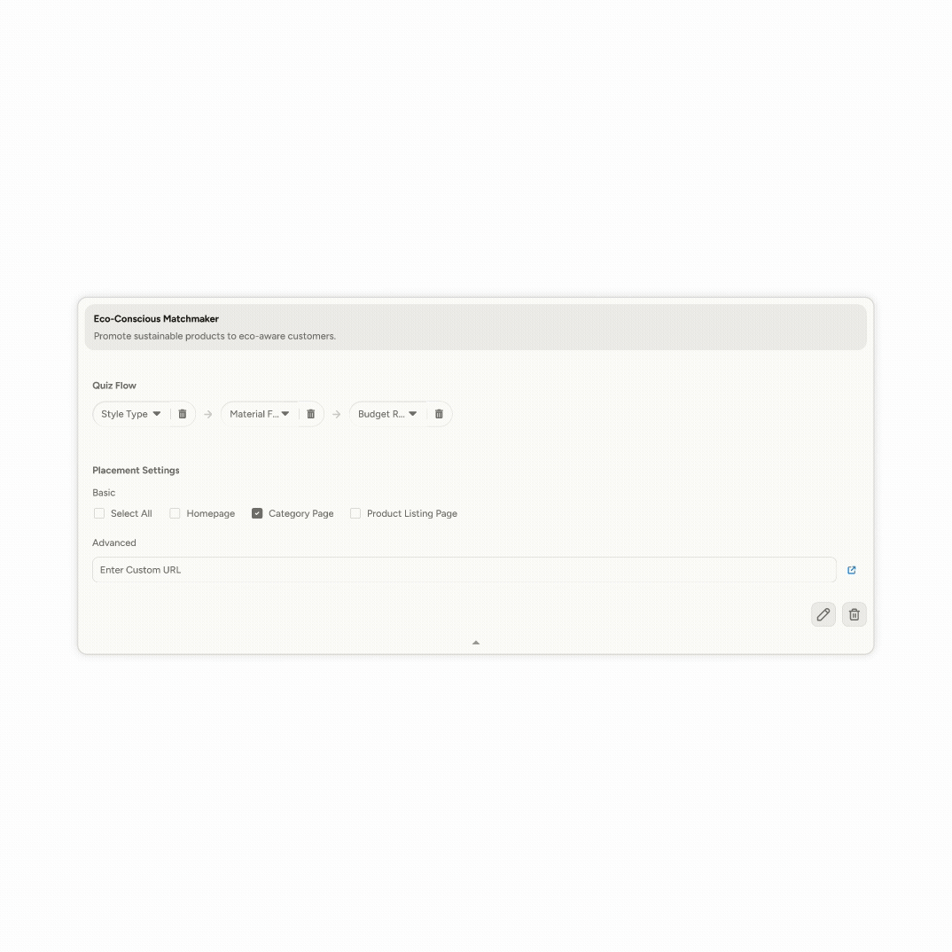
2nd Plan Builder Draft
Reflection
Learnings
01 Acknowledging limitations
With only one front-end developer, we couldn’t build everything. In that way, I learned to focus on what matters most—clarifying priorities and building systems that could still scale, even if slowly.
02 Managing multiple features with intention
I prioritized features based on project timeline, user needs, and business goals. Communicating these clearly helped align the team and gave me flexibility when trade-offs were needed.
03 Sharing ideas, design drafts, and simple prototypes
Before pitching ideas, I created quick mockups or flows. This helped spark meaningful conversations, clarify my thinking, and even led to some early ideas being adopted later on.